

Visual Hierarchy Principle | Jpress Design Tips | Website Visual Hierarchy
Effective web design relies on the ability to guide user attention strategically. The visual hierarchy is a fundamental concept that helps create organized and intuitive designs. By applying website visual hierarchy techniques, you can ensure your audience focuses on the most important elements. Here at Jpress, we provide design principles to optimize your web design for both functionality and aesthetics. Let’s explore how these principles can elevate your design game.
Read more articles:
- Website Design Trends 2025: Powerful Web Design Predictions
- White Space in Web Design | Key Tips for Effective Usage
Understanding Reading Patterns
There are two primary reading patterns in web design: the Z-pattern and the F-pattern. These layouts cater to visitors’ natural reading habits particularly in Western cultures where reading flows from left to right. By leveraging these patterns, you can create a website visual hierarchy that enhances the user experience.
- Z-Pattern Layout: This design draws attention sequentially from the top-left corner to the top-right, then diagonally to the bottom-left and finally to the bottom-right. Key elements like logos and call-to-action (CTA) buttons are strategically placed at these focal points.
- F-Pattern Layout: Ideal for text-heavy pages, this layout mimics the natural scanning pattern of the eye, moving horizontally across the top and then vertically down the left side.
Applying the visual hierarchy principle through these reading patterns ensures that your content flows seamlessly and engages users effectively.
Size Impacts Visibility
In design, size plays a crucial role in establishing emphasis. Larger elements naturally attract more attention. For example, newspaper headlines use larger fonts to highlight important stories. Similarly, in web design, larger elements like titles or images dominate user focus. The relationship between size and emphasis is further defined by scale—the size of one element in comparison to another. A balanced website visual hierarchy is achieved by strategically varying the size of elements to guide the viewer’s attention. Ensure that the most significant message or action on your page stands out with bold, large visuals or text.
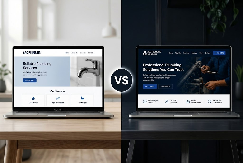
Leveraging Color and Contrast
Colors have a profound effect on user attention. Bright or high-contrast colors naturally command focus, making them essential tools in creating an effective visual hierarchy.
- Bright Colors: These are ideal for drawing attention to CTAs or key visuals. For instance, an orange button on a monochromatic background will immediately catch the eye.
- Subtle Colors: Use these for background elements or secondary information to maintain a clean design.
Contrast such as pairing light text with dark backgrounds also reinforces the visual hierarchy principle by ensuring readability and drawing attention to crucial elements.
Applying the Rule of Thirds
The rule of thirds is a versatile guideline borrowed from photography and graphic design that applies to web layouts as well. By dividing the design into a 3×3 grid and placing key elements at the intersections, you can achieve a visually appealing balance.
This technique ensures a structured website visual hierarchy without overwhelming users. For instance, placing a logo or CTA at a grid intersection creates an aesthetically pleasing focus point. Incorporating the visual hierarchy principle alongside the rule of thirds enhances design harmony and user engagement.
Organizing Design with Fonts
Typography plays a pivotal role in establishing a visual hierarchy. By varying font sizes, weights and styles, you can create a clear organizational structure.
- Headings: Use larger, bolder fonts to highlight main sections.
- Subheadings: Slightly smaller than headings, these provide a secondary level of focus.
- Body Text: Maintain a consistent and readable font size for general content.
Even with a single font, combining different sizes and weights effectively emphasizes key points. For instance, bold headings draw attention first while smaller text delivers supporting details.
Utilizing Whitespace Effectively
Whitespace or negative space is the empty area surrounding design elements. It’s a powerful yet often underappreciated aspect of the visual hierarchy principle. By providing breathing room around content, whitespace improves readability and reduces visual clutter. Contrary to popular belief, it’s not limited to minimalist designs. All types of websites benefit from whitespace, as it helps guide user focus and enhances overall engagement. A well-balanced website visual hierarchy incorporates whitespace to make designs look polished and professional.
Proximity and Relationships
Proximity refers to the spatial relationship between elements. When items are grouped closely together, users naturally perceive them as related. Strategic proximity enhances the visual hierarchy by conveying associations without additional design elements. For instance:
- Grouping a product image with its price and description creates a cohesive visual unit.
- Spacing out unrelated items avoids confusion and keeps the design clean.
Conclusion
Mastering the visual hierarchy principle is essential for creating engaging and user-friendly web designs. By focusing on visual hierarchy techniques like reading patterns, size, color and typography, you can enhance usability and captivate your audience. Incorporate these Jpress design tips to elevate your web designs and deliver exceptional user experiences. For more insights, visit Jpress in Johor for expert guidance.
Looking to elevate your online presence?
Jpress offers comprehensive services to help your business thrive in the digital world. From cutting-edge website design and development to ongoing website maintenance, we ensure your site is always in top shape. Our expert SEO services can boost your search engine rankings, while our Facebook ads marketing strategies will drive targeted traffic to your site.
Need a standout brand identity? We provide professional logo design and graphic design to make your business memorable. Explore our full range of services and see how we can support your growth. Check out Jpress Services. For personalized support, feel free to reach out to us on WhatsApp or follow us on social media.
Learn more about our website design services | Discover our SEO solutions | Explore our marketing strategies


Visual Hierarchy Principle | Jpress Design Tips | Website Visual Hierarchy
Effective web design relies on the ability to guide user attention strategically. The visual hierarchy is a fundamental concept that helps create organized and intuitive designs. By applying website visual hierarchy techniques, you can ensure your audience focuses on the most important elements. Here at Jpress, we provide design principles to optimize your web design for both functionality and aesthetics. Let’s explore how these principles can elevate your design game.
Read more articles:
- Website Design Trends 2025: Powerful Web Design Predictions
- White Space in Web Design | Key Tips for Effective Usage
Understanding Reading Patterns
There are two primary reading patterns in web design: the Z-pattern and the F-pattern. These layouts cater to visitors’ natural reading habits particularly in Western cultures where reading flows from left to right. By leveraging these patterns, you can create a website visual hierarchy that enhances the user experience.
- Z-Pattern Layout: This design draws attention sequentially from the top-left corner to the top-right, then diagonally to the bottom-left and finally to the bottom-right. Key elements like logos and call-to-action (CTA) buttons are strategically placed at these focal points.
- F-Pattern Layout: Ideal for text-heavy pages, this layout mimics the natural scanning pattern of the eye, moving horizontally across the top and then vertically down the left side.
Applying the visual hierarchy principle through these reading patterns ensures that your content flows seamlessly and engages users effectively.
Size Impacts Visibility
In design, size plays a crucial role in establishing emphasis. Larger elements naturally attract more attention. For example, newspaper headlines use larger fonts to highlight important stories. Similarly, in web design, larger elements like titles or images dominate user focus. The relationship between size and emphasis is further defined by scale—the size of one element in comparison to another. A balanced website visual hierarchy is achieved by strategically varying the size of elements to guide the viewer’s attention. Ensure that the most significant message or action on your page stands out with bold, large visuals or text.
Leveraging Color and Contrast
Colors have a profound effect on user attention. Bright or high-contrast colors naturally command focus, making them essential tools in creating an effective visual hierarchy.
- Bright Colors: These are ideal for drawing attention to CTAs or key visuals. For instance, an orange button on a monochromatic background will immediately catch the eye.
- Subtle Colors: Use these for background elements or secondary information to maintain a clean design.
Contrast such as pairing light text with dark backgrounds also reinforces the visual hierarchy principle by ensuring readability and drawing attention to crucial elements.
Applying the Rule of Thirds
The rule of thirds is a versatile guideline borrowed from photography and graphic design that applies to web layouts as well. By dividing the design into a 3×3 grid and placing key elements at the intersections, you can achieve a visually appealing balance.
This technique ensures a structured website visual hierarchy without overwhelming users. For instance, placing a logo or CTA at a grid intersection creates an aesthetically pleasing focus point. Incorporating the visual hierarchy principle alongside the rule of thirds enhances design harmony and user engagement.
Organizing Design with Fonts
Typography plays a pivotal role in establishing a visual hierarchy. By varying font sizes, weights and styles, you can create a clear organizational structure.
- Headings: Use larger, bolder fonts to highlight main sections.
- Subheadings: Slightly smaller than headings, these provide a secondary level of focus.
- Body Text: Maintain a consistent and readable font size for general content.
Even with a single font, combining different sizes and weights effectively emphasizes key points. For instance, bold headings draw attention first while smaller text delivers supporting details.
Utilizing Whitespace Effectively
Whitespace or negative space is the empty area surrounding design elements. It’s a powerful yet often underappreciated aspect of the visual hierarchy principle. By providing breathing room around content, whitespace improves readability and reduces visual clutter. Contrary to popular belief, it’s not limited to minimalist designs. All types of websites benefit from whitespace, as it helps guide user focus and enhances overall engagement. A well-balanced website visual hierarchy incorporates whitespace to make designs look polished and professional.
Proximity and Relationships
Proximity refers to the spatial relationship between elements. When items are grouped closely together, users naturally perceive them as related. Strategic proximity enhances the visual hierarchy by conveying associations without additional design elements. For instance:
- Grouping a product image with its price and description creates a cohesive visual unit.
- Spacing out unrelated items avoids confusion and keeps the design clean.
Conclusion
Mastering the visual hierarchy principle is essential for creating engaging and user-friendly web designs. By focusing on visual hierarchy techniques like reading patterns, size, color and typography, you can enhance usability and captivate your audience. Incorporate these Jpress design tips to elevate your web designs and deliver exceptional user experiences. For more insights, visit Jpress in Johor for expert guidance.
Looking to elevate your online presence?
Jpress offers comprehensive services to help your business thrive in the digital world. From cutting-edge website design and development to ongoing website maintenance, we ensure your site is always in top shape. Our expert SEO services can boost your search engine rankings, while our Facebook ads marketing strategies will drive targeted traffic to your site.
Need a standout brand identity? We provide professional logo design and graphic design to make your business memorable. Explore our full range of services and see how we can support your growth. Check out Jpress Services. For personalized support, feel free to reach out to us on WhatsApp or follow us on social media.
Learn more about our website design services | Discover our SEO solutions | Explore our marketing strategies
