

Pantone Colour of the Year 2026 | Web Design & Branding Guide
In the digital design world, colour trends influence more than just appearance. They affect how users feel, how easily they navigate a website, and how a brand is perceived online. Each year, Pantone announces a colour of the year that reflects changing visual preferences and global design directions.
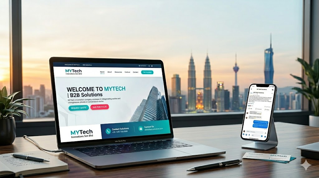
The Pantone colour of the year 2026 has officially been announced as Cloud Dancer, with the HEX value #F0EEE9. This soft, understated shade sets the tone for a more calm, balanced, and user-focused approach to web design and branding.
In this article, we explore what Cloud Dancer represents and how it can be applied effectively in modern website design.
What Is the Pantone Color of the Year 2026?
Cloud Dancer is inspired by clarity, openness, and visual comfort. It reflects a design shift toward softer tones that feel clean, light, and easy on the eyes.
Rather than focusing on bold or aggressive colours, the 2026 Pantone color trend emphasises balance and usability. This makes it especially suitable for digital platforms where users expect smooth navigation and a pleasant browsing experience.
1. Creates a Clean and Modern Website Look
One of the biggest benefits of using the pantone colour of the year 2026 in web design is its ability to create a clean and modern appearance.
Websites that use lighter, well-balanced color palettes often feel more organised and professional. This is especially effective for:
- Corporate websites
- Service-based businesses
- Technology and consulting brands
A clean visual style helps users focus on content and calls to action without unnecessary distractions.
2. Improves User Experience and Visual Comfort
Colour plays a direct role in user experience. Softer tones reduce visual strain, especially during longer browsing sessions or mobile use.
Cloud Dancer works well in areas such as:
- Background sections
- Content blocks and cards
- Supporting interface elements
When combined with readable typography and sufficient spacing, this colour enhances clarity and keeps users engaged without overwhelming them.
3. Supports Minimalist Web Design Trends
Minimalist web design continues to be a strong and practical trend. The Pantone colour of the year 2026 fits naturally into this design approach.
Because Cloud Dancer is subtle and flexible, it pairs well with:
- White or light grey backgrounds
- Neutral typography
- Simple iconography
This makes it ideal for brands that prefer a timeless design rather than one driven by short-lived visual trends.

4. Enhances Brand Trust and Professionalism
Colour choice influences how trustworthy and credible a brand appears. Balanced, neutral tones often convey stability and confidence.
For businesses offering professional services such as web design, consulting, education, or B2B solutions, Cloud Dancer helps reinforce a calm and reliable brand image. It communicates professionalism without appearing cold or distant.
5. Easy to Apply Across Digital Platforms
Another benefit of the 2026 Pantone colour is its versatility. Cloud Dancer can be applied consistently across:
- Websites
- Landing pages
- Social media visuals
- Digital marketing materials
This consistency helps maintain a cohesive brand identity across different platforms while keeping visual elements aligned.
How to Use Cloud Dancer in Web Design
You do not need a full website redesign to follow this colour trend. Practical ways to incorporate Cloud Dancer include:
- Section backgrounds or feature areas
- Call-to-action highlights
- Cards, dividers, or UI components
- Subtle accents that support content flow
The key is moderation. Cloud Dancer works best as a supporting colour that enhances clarity rather than dominating the design.
Final Thoughts
The Pantone colour of the year 2026, Cloud Dancer (#F0EEE9), reflects a move toward calm, clarity, and long-term usability in digital design. Instead of making bold visual statements, it supports user-focused experiences that prioritise comfort and readability.
At Jpress, we believe effective web design starts with thoughtful colour choices that balance aesthetics and functionality. Understanding colour trends like this allows businesses to create websites that feel modern, structured, and relevant well beyond a single year.


Pantone Colour of the Year 2026 | Web Design & Branding Guide
In the digital design world, colour trends influence more than just appearance. They affect how users feel, how easily they navigate a website, and how a brand is perceived online. Each year, Pantone announces a colour of the year that reflects changing visual preferences and global design directions.
The Pantone colour of the year 2026 has officially been announced as Cloud Dancer, with the HEX value #F0EEE9. This soft, understated shade sets the tone for a more calm, balanced, and user-focused approach to web design and branding.
In this article, we explore what Cloud Dancer represents and how it can be applied effectively in modern website design.
What Is the Pantone Color of the Year 2026?
Cloud Dancer is inspired by clarity, openness, and visual comfort. It reflects a design shift toward softer tones that feel clean, light, and easy on the eyes.
Rather than focusing on bold or aggressive colours, the 2026 Pantone color trend emphasises balance and usability. This makes it especially suitable for digital platforms where users expect smooth navigation and a pleasant browsing experience.
1. Creates a Clean and Modern Website Look
One of the biggest benefits of using the pantone colour of the year 2026 in web design is its ability to create a clean and modern appearance.
Websites that use lighter, well-balanced color palettes often feel more organised and professional. This is especially effective for:
- Corporate websites
- Service-based businesses
- Technology and consulting brands
A clean visual style helps users focus on content and calls to action without unnecessary distractions.
2. Improves User Experience and Visual Comfort
Colour plays a direct role in user experience. Softer tones reduce visual strain, especially during longer browsing sessions or mobile use.
Cloud Dancer works well in areas such as:
- Background sections
- Content blocks and cards
- Supporting interface elements
When combined with readable typography and sufficient spacing, this colour enhances clarity and keeps users engaged without overwhelming them.
3. Supports Minimalist Web Design Trends
Minimalist web design continues to be a strong and practical trend. The Pantone colour of the year 2026 fits naturally into this design approach.
Because Cloud Dancer is subtle and flexible, it pairs well with:
- White or light grey backgrounds
- Neutral typography
- Simple iconography
This makes it ideal for brands that prefer a timeless design rather than one driven by short-lived visual trends.
4. Enhances Brand Trust and Professionalism
Colour choice influences how trustworthy and credible a brand appears. Balanced, neutral tones often convey stability and confidence.
For businesses offering professional services such as web design, consulting, education, or B2B solutions, Cloud Dancer helps reinforce a calm and reliable brand image. It communicates professionalism without appearing cold or distant.
5. Easy to Apply Across Digital Platforms
Another benefit of the 2026 Pantone colour is its versatility. Cloud Dancer can be applied consistently across:
- Websites
- Landing pages
- Social media visuals
- Digital marketing materials
This consistency helps maintain a cohesive brand identity across different platforms while keeping visual elements aligned.
How to Use Cloud Dancer in Web Design
You do not need a full website redesign to follow this colour trend. Practical ways to incorporate Cloud Dancer include:
- Section backgrounds or feature areas
- Call-to-action highlights
- Cards, dividers, or UI components
- Subtle accents that support content flow
The key is moderation. Cloud Dancer works best as a supporting colour that enhances clarity rather than dominating the design.
Final Thoughts
The Pantone colour of the year 2026, Cloud Dancer (#F0EEE9), reflects a move toward calm, clarity, and long-term usability in digital design. Instead of making bold visual statements, it supports user-focused experiences that prioritise comfort and readability.
At Jpress, we believe effective web design starts with thoughtful colour choices that balance aesthetics and functionality. Understanding colour trends like this allows businesses to create websites that feel modern, structured, and relevant well beyond a single year.
